Booking page design that gets patients seen, not just clicked

A compliant, high-converting patient booking page is accessible, safe, fast, and integrated with your clinical systems. That means it meets WCAG 2.2 AA contrast and keyboard standards, respects AHPRA advertising rules, loads its booking widget in under two seconds, and syncs straight into your practice management software.
The fastest way to check where you stand: open your homepage on a phone right now and time how long it takes the booking widget to become interactive. If it’s over two seconds, or the “Book now” button isn’t visible without scrolling, you’re losing patients before they’ve even seen a practitioner’s name.
Two numbers worth anchoring to:
-
Widget interactivity target: under 2 seconds, tested on a real mobile connection, not just office wifi.
-
If you’re layering practitioner matching on top of booking, keep the clinic in control: Meddle matches by discipline, location and the capacity each clinician has shared, then routes the referral, and the clinic confirms the booking.
Key Takeaways
An effective healthcare booking page combines WCAG 2.2 AA accessibility, sub-two-second widget load times, trust signals that follow Ahpra’s advertising guidance (such as registration checked against the relevant register), and direct practice management integration.
| Point | Details |
|---|---|
| Accessibility is non-negotiable | Meet WCAG 2.2 AA contrast (4.5:1 normal text) and full keyboard navigation on every booking step. |
| Speed decides completions | Keep booking widget interactivity under 2 seconds, tested on real mobile networks. |
| Split new and returning patients | Ask modality and patient type first to avoid re-entering identification fields unnecessarily. |
| Integration prevents double-handling | Sync bookings directly with practice management systems and plan My Health Record conformance separately. |
| AI matching reduces admin load | Meddle matches by discipline, location and the capacity clinicians have shared, routes the referral, and works alongside your practice software. |
This article is general information, not a substitute for advice from a qualified doctor. Consult a qualified healthcare professional about your own circumstances before acting on anything here.
Table of Contents
-
What makes an effective booking page for allied-health clinics?
-
What data protection rules apply beyond basic privacy notices?
-
How can booking pages support repeat patients and personalisation?
What makes an effective booking page for allied-health clinics?
Three things sit above everything else on a patient-facing booking page: accessibility, patient safety, and regulatory trust signals. Get these wrong and you’re not just losing conversions, you’re creating liability.
-
Meet WCAG 2.2 AA as your floor, not your ceiling. That means a contrast ratio of at least 4.5:1 for normal text and 3:1 for large text, tap targets sized for people with reduced dexterity, and full keyboard navigation through every booking step. A patient with low vision or a tremor should be able to complete a booking without touching a mouse.
-
Present clinical information without ambiguity. If your booking flow displays medication names, dosages, or treatment types anywhere, national guidelines on on-screen medicines display require consistent, unambiguous formatting to reduce clinical error, even in consumer-facing systems.
-
Respect AHPRA’s advertising constraints. No patient testimonials on public booking pages. Show practitioner registration numbers and health fund provider numbers where relevant, because that’s what builds legitimate trust, not a five-star quote you can’t verify. If you display private health fund eligibility, keep the language accurate, since fund offer conditions and waiting periods vary and overstating them is a compliance risk.
-
Design privacy in from the first field. Ask for the bare minimum at booking (name, contact, reason for visit), encrypt everything in transit with TLS, and link a short privacy notice near the submit button rather than burying it in a footer nobody reads.
Get this foundation wrong and every other optimisation, sticky buttons, instant confirmations, and AI matching is built on sand.
How should you design the booking widget for conversion?
Redirecting patients to a third-party portal costs you completions. Embedding the widget directly on your site keeps them in a familiar environment and cuts the drop-off that happens every time someone hits an unfamiliar domain mid-booking.
Placement and speed decide most of the outcome from there:
-
Put the primary booking action above the fold on your homepage and every service page, not just a “Contact Us” link three scrolls down.
-
Use a persistent, sticky “Book now” control that stays visible as the patient scrolls. Sticky navigation research shows this reduces cognitive load because the patient never has to hunt for the action again.
-
Show “next available” times directly on the page rather than making patients click through to find out. Visible availability removes the biggest source of decision friction in any booking flow.
-
Split new and returning patients at the very first step. Returning patients already have a file, so forcing them to re-enter identification details is friction with no clinical benefit.
Clinics that show their available appointment times above the fold consistently report fewer lost bookings than sites that force a phone call to confirm a time.
Pro Tip: Test your widget’s load time on a throttled 4G connection, not your clinic wifi. Rural and older-phone patients are exactly the group most likely to abandon a slow booking flow, and they’re often the ones who need the appointment most.
How do you structure intake so AI matching actually works?
Patients don’t think in specialist labels. Someone with a frozen shoulder doesn’t know if they need a physiotherapist, an exercise physiologist, or an osteopath, and a booking form that demands they choose will lose them at step one.
-
Map plain-language symptoms to structured clinical intent. Ask “What’s bothering you?” with free text or simple checkboxes, then let the matching logic translate that into the right discipline behind the scenes.
-
Capture care modality early. Telehealth or in-person needs to be a first-step question, not an afterthought, especially where state-based service eligibility affects what’s available to a given patient.
-
Keep the initial form short. Name, contact, reason for visit, and modality is enough to get a booking confirmed. Full clinical history belongs in a pre-appointment form sent after confirmation, not blocking the booking itself.
-
Explain the match, briefly. A single line like “We’ve matched you with Sarah because she specialises in shoulder rehabilitation” does more for trust than any amount of design polish.
This isn’t just good UX design, it’s the difference between a booking system and a matching system. Case evidence from conversational AI provider-matching shows that natural-language symptom intake mapped to structured provider data measurably cuts search abandonment compared with forcing patients to self-select a specialty.
Pro Tip: If your matching logic returns more than one suitable practitioner, show the patient why each was suggested rather than just a name and a photo. A short rationale line turns a coin-flip decision into an informed one.

What technical integrations does a booking page need?
A booking page that looks great but doesn’t talk to your clinical systems just creates double-handling for your front desk. Three integration layers matter most: practice management sync, health record conformance, and security.
Your booking widget needs to write directly into your practice management system, appointments, patient records, and calendar availability, in real time, so a slot booked online can’t also be booked by reception five minutes later. Secure messaging between the booking system and practitioners closes the loop on confirmations and reschedules.
If your clinic connects to My Health Record, the Australian Digital Health Agency’s usability guidance recommends transparent record status and intuitive navigation, principles that apply directly to how a booking confirmation should surface a patient’s Individual Healthcare Identifier (IHI) status. Production access to My Health Record typically requires a separate conformance testing and sign-off process, so plan for that as its own project milestone, not a launch-week afterthought.
| Requirement | What it covers |
|---|---|
| Practice management sync | Real-time appointment and patient record updates to prevent double-booking |
| Data encryption | TLS in transit and encryption at rest for all patient data |
| Access control | Role-based permissions and audit logging for who views what |
| Error handling | Retry logic for API failures and clear messaging on slot conflicts |
Availability SLAs matter too. If your booking widget goes down during business hours because a third-party API failed, patients need a fallback, whether that’s a phone number surfaced automatically or a clear “try again shortly” message rather than a blank screen.
What should be on your pre-launch testing checklist?
Run this before any booking page goes live, not after the first complaint comes in.
-
Accessibility audit. Run an automated WCAG scan, then do a manual pass with keyboard-only navigation and a screen reader. Automated tools miss most real usability failures.
-
Performance benchmarks. Target Largest Contentful Paint under 2.5 seconds, widget interactivity under 2 seconds, and Cumulative Layout Shift under 0.1. Test on an actual mobile network, not office broadband.
-
Functional edge cases. Walk through new-patient and returning-patient flows, telehealth bookings, cancellations, reschedules, and what happens when two people try to book the same slot simultaneously.
-
Privacy and incident readiness. Confirm your privacy notice is visible at the point of data capture, that you’re collecting the minimum necessary, and that you have a Notifiable Data Breaches contact plan ready before you need it.
Pro Tip: Book a test appointment yourself, on your own phone, using mobile data, the week before launch. Reading a checklist and living the flow catch different problems.
Does your booking page need multilingual support?
If your patient base includes people who don’t speak English as a first language, and most allied-health clinics in urban and outer-metro areas do, your booking page needs to work in more than one language before it needs to look impressive.
The simplest approach is a language selector at the very top of the page, defaulting to the patient’s browser or device language where possible rather than forcing a manual switch. Translated content needs to cover the entire booking flow, not just the homepage: form labels, error messages, and confirmation text all need translation, because a patient who books successfully in Vietnamese but receives an English-only confirmation email is left just as confused as one who couldn’t complete the form at all.
Machine translation can work for low-stakes content like general clinic information, but anything touching consent, appointment details, or clinical intake deserves a properly reviewed translation. A mistranslated symptom description feeding into your AI matching logic doesn’t just produce a bad match, it can send a patient to the wrong type of practitioner entirely.
Keep the visual design consistent across languages. Text that expands significantly when translated (German and Finnish are notorious for this) needs to be tested against your button sizes and form layouts so nothing truncates or overlaps. And don’t forget interpreter booking as an option at the intake stage itself, so patients who need one aren’t discovering that requirement only after they’ve already tried and failed to book.

What data protection rules apply beyond basic privacy notices?
A privacy notice on your booking form is table stakes, not the finish line. Health information carries a higher legal bar than most personal data, and your booking page needs to reflect that in how it’s built, not just how it’s worded.
Data minimisation is the practical starting point: collect only what’s needed to confirm and deliver the appointment at the booking stage, and defer anything more sensitive, full medical history, current medications, mental health disclosures, to a secured pre-appointment form sent after confirmation. Every field you don’t ask for at booking is a field you don’t have to secure, audit, or explain if something goes wrong.
Encryption needs to apply both in transit (TLS on every page of the flow, not just the payment step if there is one) and at rest, meaning stored patient data sits encrypted in your database, not just protected by a login screen. Role-based access matters just as much: reception staff, practitioners, and admin should see only the data relevant to their role, with an audit log recording who accessed what and when.
If your clinic operates internationally or handles data for patients based in the European Union, GDPR’s stricter consent and data-portability requirements apply on top of local obligations, and that’s a genuinely separate compliance exercise worth scoping with legal advice rather than assuming your local privacy notice covers it. For clinics operating solely in Australia, the Notifiable Data Breaches scheme still requires a documented response plan, ready before an incident, not drafted during one.
How can booking pages support repeat patients and personalisation?
The best booking experience for a returning patient is the one that remembers them. Saved preferences, preferred practitioner, preferred appointment time, preferred location for multi-site clinics, turn a five-minute booking into a thirty-second one.
Practices should split new and returning patient journeys at the very first step of the flow, and returning patients shouldn’t be asked to re-enter identification details they’ve already provided. A “Book again with Sarah” one-click option for a patient who’s seen the same practitioner three times isn’t a luxury feature, it’s removing friction for the group most likely to convert if you make it easy.
Personalisation doesn’t need to be complicated. Showing a returning patient their next available slot with their usual practitioner, pre-filling their contact details, and remembering their preferred communication channel (SMS versus email for appointment confirmation emails) covers most of the value. The risk is over-engineering this into something that feels invasive. Patients want convenience, not a system that seems to be tracking them.
Where AI-driven matching sits behind your booking page, personalisation extends further: a returning patient whose needs have changed can be re-matched without starting the intake process from scratch, because the system already holds their relevant history. That’s a meaningfully different experience from a static booking form that treats every visit as the first one.
How should errors and feedback work during booking?
Nothing kills trust in a booking flow faster than a silent failure. A patient who clicks “Confirm” and sees nothing happen will either try again (creating a duplicate booking) or give up entirely.
Every failure state needs a clear, plain-language message. “That time slot was just booked by someone else, here are the next three available times” is infinitely better than a generic error code or, worse, no message at all. Slot conflicts are the most common failure in real-time booking, and your system needs retry logic that checks availability again before showing the patient a dead end.
Form validation should happen inline, as the patient types or moves between fields, not only after they hit submit and lose everything they’ve entered. If a phone number field expects a specific format, say so before the error rather than after. And every successful booking needs immediate, visible confirmation on-screen, not just a promise that “an appointment confirmation message is on its way”, because patients want proof the booking worked before they close the tab.
Appointment confirmation emails deserve the same care as the booking flow itself. Include the practitioner’s name, the exact time and location or telehealth link, and a clear way to reschedule or cancel, because a confirmation email that just says “your appointment is booked” with no detail generates a phone call your reception desk didn’t need to field.
Which rollout path fits your clinic?
Three realistic paths exist, and the right one depends on your timeline and appetite for ongoing integration work.
Option A, embed your existing practice management system’s widget, is the fastest rollout if your current PMS already offers one. It’s limited by whatever that vendor built, and matching intelligence is usually minimal or absent.
Option B, build a custom API integration, gives you deeper control and reliability but demands real engineering resources and ongoing maintenance as your PMS updates.
Option C, adopt an integrated AI matching and booking platform, is the strongest fit when matching accuracy and admin reduction matter as much as the booking form itself. Meddle combines both in one rollout, sparing clinics the separate procurement of a matching layer bolted onto a booking widget. Decide based on timeline, available engineering resources, and whether AI-driven matching is a genuine priority or a nice-to-have. If matching quality matters to your patients, Meddle’s practitioner benefits page is worth a look before you commit engineering hours to Option B.
See how Meddle handles booking and matching together
Meddle gives clinics one rollout instead of two separate builds, an AI matching layer and a booking flow that already talk to each other, rather than a booking widget you bolt matching logic onto later. That matters most for allied-health teams weighing Option B against Option C above: you get the deeper integration reliability without carrying the full engineering cost yourself.
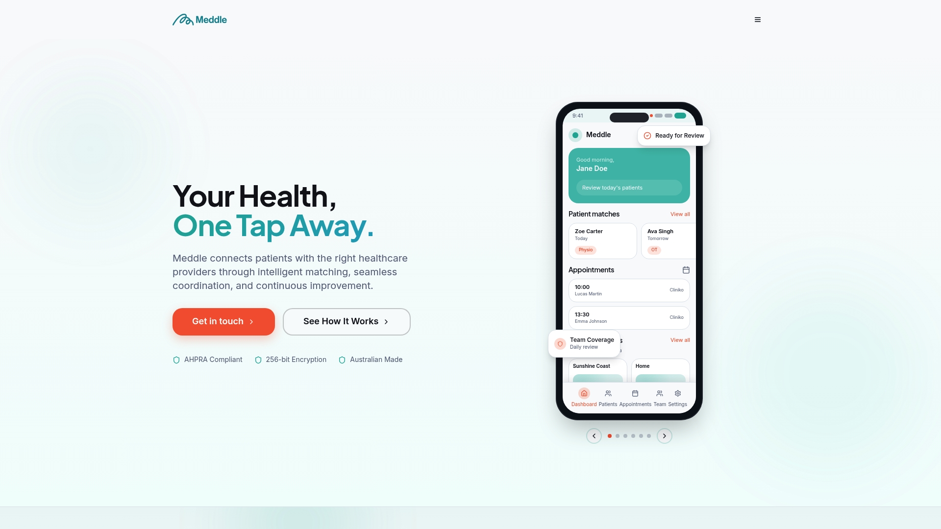
Meddle matches patients by discipline, location and the capacity each clinician has shared, then routes the referral; the clinic confirms the booking. It’s built for allied-health workflows rather than adapted from a generic scheduling tool, and it works alongside your practice software. If you manage a clinic and want to see whether this approach suits your patient volume and admin load, the simple rollout page outlines pricing from $40 per practitioner per month (ex GST, $250 monthly minimum), with SMS and email notifications included, and what the first weeks look like.
Sources
FAQ
What is the minimum contrast ratio for a booking page under WCAG 2.2 AA?
Normal text needs a contrast ratio of at least 4.5:1, and large text needs at least 3:1, along with keyboard-accessible navigation through every booking step.
Should booking widgets redirect to a third-party site or stay embedded?
Embedding a booking widget directly on your clinic’s own site improves completion rates compared with redirecting, because patients stay in a familiar environment rather than landing on an unfamiliar domain mid-booking.
Can a booking page display patient testimonials?
No. AHPRA’s advertising rules prohibit patient testimonials on public-facing healthcare pages, so trust needs to come from visible registration numbers, provider numbers, and clear practitioner credentials instead.
How does AI matching improve on a standard booking form?
AI matching maps plain-language symptoms to the right clinical discipline automatically, so patients don’t need to know whether they need a physiotherapist or an osteopath before they book.
What’s the performance target for a booking widget?
Aim for widget interactivity under 2 seconds and Largest Contentful Paint under 2.5 seconds, tested on a real mobile network rather than office wifi.
Do returning patients need to complete the full intake form again?
No. Returning patients should skip re-entering identification details entirely, with the booking flow split between new and returning patients at the very first step.