Practice Managers: 5 Governance First KPI Pillars for Your Dashboard

Your practice dashboard should show five KPI pillars: clinical quality, operational efficiency, financial health, patient experience, and workforce, using a focused set of primary metrics such as net collection rate, provider utilisation, no-show rate, days in accounts receivable, daily collected revenue and a wait-time or patient experience indicator. It is important to assign an owner to each metric, set visible thresholds, and schedule brief regular reviews.
TL;DR:
- Most clinics should limit primary dashboard metrics to around eight, focusing on outcomes like net collection rate, provider utilisation, and no-show rate for quick decision-making.
- All metrics must have a clear owner, source, and threshold, with regular reviews—daily quick checks, weekly detailed evaluations, and monthly governance to ensure relevance and accuracy.
- Connecting the dashboard to practice management or EHR systems via automated feeds enhances data reliability and timeliness, reducing manual errors and lag issues.
- Thresholds for key metrics like net collection rate above 95% and utilisation between 70-85% serve as practical benchmarks, but adjustments should reflect practice-specific conditions.
- Excess metrics, unclear ownership, or outdated thresholds lead to ineffective dashboards; start small, enforce ownership, and continually refine your metric set.
Table of Contents
- What are the core practice dashboard metrics to track?
- How do you calculate the key practice metrics?
- Which metrics actually belong on your dashboard?
- How should a dashboard be laid out for fast decisions?
- What should you check daily, weekly and monthly?
- How do you keep dashboard data trustworthy?
- How does Meddle’s dashboard put this into practice?
- What’s a realistic benchmark for these metrics?
- How do dashboards connect with your EHR and practice management system?
- Author perspective: three sanity checks before you trust a dashboard
- Turn these metrics into a working dashboard with Meddle
- Sources
- FAQ
What are the core practice dashboard metrics to track?
Most clinics fail their dashboard before they build it, by trying to show everything. A cluttered screen with 20 metrics gets glanced at once and ignored forever. The fix is a tight primary layer for daily decisions, backed by a secondary layer you only open when something looks wrong.
Primary metrics, visible at a glance:
- Net collection rate — the percentage of collectable revenue you actually collect, the single best gauge of billing health.
- Provider utilisation — booked clinical hours against available hours, per practitioner and clinic-wide.
- No-show/DNA rate — the share of booked appointments where the patient doesn’t attend, directly eating into capacity.
- Days in accounts receivable (AR) — how long, on average, invoices sit unpaid.
- Daily collected revenue — cash actually banked, not just billed.
- NPS or wait-time indicator — a proxy for the patient experience pillar that flags problems before they show up in reviews.
Secondary metrics, kept as drill-downs: referral conversion rate, denial rate by payer, revenue per practitioner, rebooking rate, cancellation lead time, and average time-to-first-appointment. These matter, but they explain the primary metrics rather than replacing them. If net collection rate turns red, denial rate by payer is where you go next.
A workable threshold table looks like this for a mid-sized allied health clinic:
| Metric | Green | Yellow | Red |
|---|---|---|---|
| Net collection rate | 94% | 90–95% | Below 90% |
| Provider utilisation | 75% | 60–74% | Below 60% |
| No-show rate | Below 8% | 8–10% | Above 10% |
| Days in AR | Under 30 | 30–40 | Over 40 |
Industry benchmarking consistently points to maximising appointment utilisation while keeping DNA rates low as the two levers with the fastest payoff, because both directly protect clinical capacity without needing new patients or new staff. Set your own thresholds against your specialty mix and payer terms rather than copying these numbers outright, they’re a starting point, not gospel.
How do you calculate the key practice metrics?
Every metric on your dashboard needs a documented formula, or you’ll end up with three people calculating “utilisation” three different ways. Here’s how to define the ones that matter most.
-
Net collection rate = (Payments received ÷ (Charges − contractual adjustments)) × 100. Run it monthly on a rolling basis, because single-week snapshots get distorted by payment timing lags. A clinic billing $200,000 in adjusted charges and collecting $188,000 sits at 94%, solidly yellow on the table above.
-
Provider utilisation = (Booked clinical hours ÷ Available clinical hours) × 100. Available hours should exclude admin blocks, leave and non-clinical meetings, not just rostered shifts, or you’ll overstate the gap. Contractor arrangements need a separate line, since a visiting practitioner working two days a week has a different available-hours baseline than a full-time employee.
-
Days in AR = Total outstanding receivables ÷ (Total charges ÷ number of days in the period). A 30-day reporting window is standard; anything longer hides deterioration too well to act on.
-
No-show rate = (Appointments missed without notice ÷ Total scheduled appointments) × 100. Exclude same-day cancellations from the numerator if you track those separately, mixing the two muddies the action you’d take for each.
-
Revenue per visit or per practitioner = Total revenue ÷ number of visits (or ÷ number of FTE practitioners). Multidisciplinary clinics should calculate this per discipline, since a physio and a dietitian generate very different revenue per hour, and blending them into one average hides underperformance in either.
-
NPS = % Promoters − % Detractors, from a single post-visit survey question scored 0–10. Local KPI guides for Australian practices recommend surveying a rolling sample rather than every patient, response fatigue kills your data quality faster than a smaller sample size does.
The denominator is where most dashboards quietly lie. Utilisation calculated against rostered hours rather than truly available clinical hours can overstate capacity by 15 percentage points or more. Always ask what’s excluded from the denominator before trusting the number on screen.
Which metrics actually belong on your dashboard?
The discipline here isn’t finding more metrics, it’s saying no to most of them. Cap primary metrics at around eight, with no more than three secondary ones visible without a click. Beyond that point, cognitive load defeats the purpose of a glance-and-act dashboard.
Weight your metric mix toward outcomes over activity, roughly 60/40. A dashboard full of activity counts, appointments booked, calls made, forms sent, feels productive but tells you nothing about whether the practice is actually healthier. Outcome metrics like net collection rate and utilisation tell you what activity actually produced.
Every metric you keep needs five things nailed down before it goes live:
- Owner — one named person accountable for the number, not a team.
- Source — the exact system or report the figure comes from.
- Refresh cadence — how often it updates (real time, daily, weekly).
- Threshold — the visible target and its red/yellow/green bands.
- Action path — what the owner does when it turns yellow or red.
Run a short workshop with your practice managers and finance lead before finalising the list. Walk through each candidate metric and ask three questions: does someone check this weekly, does anyone change behaviour because of it, and can we name its owner right now. Any metric that fails two of the three gets cut or demoted to the secondary layer.
Pro Tip: If a metric has been on your dashboard for three months and nobody has asked a question about it, it’s decoration, not data. Cut it and see if anyone notices.
How should a dashboard be laid out for fast decisions?
Design for one audience per screen. A dashboard built to satisfy the practice manager, the finance lead and referring practitioners at once ends up satisfying none of them, because each group needs a different subject and a different level of detail. Build the owner view first, then branch into role-specific drill-downs.
Layout rules that actually speed up decisions:
- Keep primary metrics above the fold, on one screen, with no scrolling required to see the full set.
- Use consistent colour semantics throughout, red always means “act now,” never “just FYI” in one chart and “urgent” in another.
- Add sparklines next to each headline number so a manager sees the trend, not just the current value, in under two seconds.
- Limit chart types to three or four across the whole dashboard, line for trends, bar for comparisons, a single stat tile for point-in-time figures. Variety for its own sake slows recognition.
- Target sub-two-second load times and daily data refresh at minimum for anything driving daily decisions.
Research into dashboard adoption in healthcare settings backs this restraint. Human-centred, iterative design paired with clarity about who the dashboard serves and attention to data quality consistently predicts whether a dashboard gets used six months after launch or quietly abandoned. A related review of dashboard information design makes a similar point: a dashboard needs a resolved purpose, consumer and subject or it risks confusing the very people it’s meant to help.
For non-technical staff, avoid dual-axis charts and anything requiring a legend to interpret. If a receptionist covering the front desk can’t read the utilisation tile at a glance, the chart has failed regardless of how accurate the underlying number is.
What should you check daily, weekly and monthly?
A dashboard without a review rhythm is just a screensaver. Build the cadence into the practice’s operating routine, not as an optional extra task.
-
Daily, ten minutes. Check the revenue trend against yesterday and against the same weekday last month, scan provider utilisation for the day, flag any AR items over 90 days, and note any metric that’s flipped to red overnight. This is a glance, not an investigation.
-
Weekly, thirty to forty-five minutes. Pull the owner of every red or yellow metric into a short review. Walk through what changed, what the owner is doing about it, and whether the threshold itself needs adjusting. This is where denial rate by payer, rebooking rate and referral conversion earn their place as drill-downs.
-
Monthly, a full governance session. Look at trend lines rather than single points, adjust targets if the practice has grown or added services, and benchmark performance across locations if you run more than one site. Phased dashboard rollouts that start with outcome metrics before adding operational and executive layers tend to see steadier adoption than practices that launch everything simultaneously.
Skipping the weekly layer is the most common failure point. Daily checks catch symptoms; only the weekly review assigns and closes the loop on causes.
How do you keep dashboard data trustworthy?
A dashboard is only as credible as its weakest data feed. Every metric needs a documented calculation, a single source of truth, and automated feeds wherever your practice management system supports them, manual re-entry is where errors compound fastest.
Common data problems and how to fix them:
- Duplicate bookings from patients rebooking across two channels inflate utilisation. Reconcile against a unique patient-appointment ID, not a raw booking count.
- Delayed billing feeds make net collection rate look worse than it is mid-month. Note the feed’s known lag in the dashboard itself so nobody panics over a stale number.
- Coding mismatches between clinicians and billing staff distort revenue-per-visit figures. A monthly coding audit against a sample of files catches this before it snowballs.
Refresh frequency should match how the metric gets used. Same-day scheduling data can run near real time. Financial metrics like net collection rate are fine on a daily batch. Trend-based figures like NPS or referral conversion only need a weekly pull, more frequent updates just add noise. Evaluation frameworks for clinical dashboards consistently stress that identifying valuable metrics for the right actors and ensuring data accuracy and timeliness drives adoption more than any visual polish does.
How does Meddle’s dashboard put this into practice?
Meddle’s practice management dashboard is built around the same five-pillar structure this guide walks through, clinical quality, operational efficiency, financial health, patient experience and workforce, so clinics aren’t reinventing metric categories from scratch. The dashboard sits alongside a referral scorecard that tracks conversion and source quality, and an Admin Hours Saved Estimator that quantifies how much manual scheduling and intake work the platform’s matching removes from your team’s week.
Clinics using the platform can treat that figure as a comparison point when reviewing their own patient-to-practitioner match quality.
A 30-day pilot works well as a first test:
- Week 1: connect your practice management system feed and confirm your primary metric list against the eight-metric cap.
- Week 2: assign owners and thresholds, then run the Admin Hours Saved Estimator against your current intake process.
- Weeks 3 to 4: run daily and weekly reviews as described above, and compare admin hours saved against the estimator’s baseline.
What’s a realistic benchmark for these metrics?
Benchmarks vary meaningfully by discipline, so treat any published range as a starting point to adjust, not a hard pass/fail line. A solo psychology practice and a multidisciplinary physiotherapy clinic with imaging on-site will land in different bands for both utilisation and revenue per practitioner.
That said, some ranges hold reasonably steady across allied health settings. Net collection rate above 95% is generally considered strong; anything consistently under 90% points to a billing process problem rather than a one-off bad month. Allied health specific KPI guides put healthy utilisation in the 70 to 85% range for most disciplines, with the upper end reserved for high-demand specialties with longer wait lists.

Set your first-year target as an improvement on your own baseline rather than an external number.
Revisit targets every quarter, not every month. Monthly target changes make it hard to tell whether a metric moved because performance changed or because you moved the goalposts.
How do dashboards connect with your EHR and practice management system?
Your dashboard is only as good as its connection to the systems generating the underlying data. Most practice management platforms and electronic health record systems expose scheduling, billing and clinical note data through an API or a scheduled export, and that feed is what should populate your dashboard automatically rather than someone re-typing numbers from a report each week.
The practical priority order is scheduling and billing data first, since that’s what drives utilisation, no-show rate, net collection rate and days in AR, the four metrics most likely to sit on your primary layer. Clinical outcome data from the EHR typically integrates second, feeding the clinical quality pillar once the operational and financial layers are stable and trusted.
Where a direct API integration isn’t available, a nightly scheduled export into a reporting layer is a workable substitute, provided everyone understands the data is a day old rather than live. Document that lag on the dashboard itself so a manager checking AR at 8am doesn’t mistake yesterday’s snapshot for this morning’s reality.

Author perspective: three sanity checks before you trust a dashboard
Three checks catch most bad dashboards before they cause bad decisions. First, can you name the owner of every red metric without checking a document? If not, the dashboard is decorative. Second, does the mix lean activity over outcome? Booked-calls counters feel busy but rarely change what you do next. Third, ask whether anyone has adjusted a threshold in the last quarter, static targets on a growing practice usually mean nobody’s actually looking.
The biggest pitfall isn’t too few metrics, it’s too many with no owner attached. Start smaller than feels comfortable. Pick one metric to tighten this month, most likely no-show rate or days in AR, and measure whether a single owner with a clear action path moves it before adding anything else to the screen.
— Taylor
Turn these metrics into a working dashboard with Meddle
Meddle is the practical route to a governed dashboard without building one from spreadsheets and hope. Where a generic reporting tool leaves you defining formulas and chasing data feeds yourself, Meddle’s practice management dashboard ships with the five-pillar structure and primary metrics already mapped to your booking and referral data.
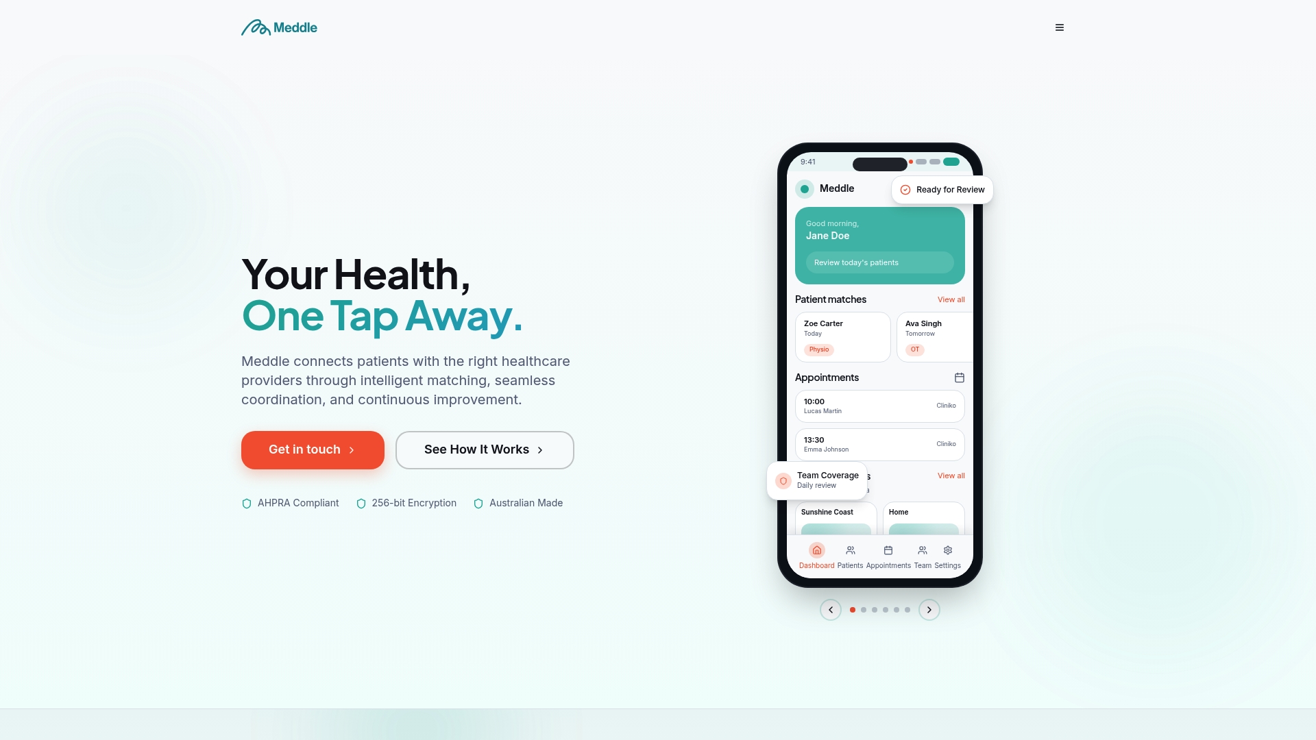
Pair that with the Admin Hours Saved Estimator to put a real number on how much manual scheduling work your team can hand off, then use that figure as a baseline for your first monthly review. If patient experience metrics are your weak pillar, practical steps for lifting patient satisfaction sit alongside the dashboard tools to close that gap.
Head to Meddle’s platform to see how the dashboard maps to your practice, and run the Admin Hours Saved Estimator against your current process this week.
Sources
- Design practices for data dashboards in health care: scoping review
- Healthcare dashboards that change decisions — ClearPoint Strategy
FAQ
What are metrics in a dashboard?
Metrics are the specific, measurable numbers a dashboard displays to track performance, such as net collection rate or provider utilisation, each tied to a formula, a data source and a target range.
What is the “5 second rule” for dashboards?
It’s a design principle stating a viewer should grasp the key message of a chart or dashboard within about five seconds, which is why sparklines, consistent colour coding and a single-screen primary layer matter more than extra detail.
What KPIs should my practice dashboard track?
Focus on net collection rate, provider utilisation, no-show rate, days in accounts receivable, daily collected revenue and a patient experience indicator like NPS or wait times, capped at around eight primary metrics total.
Can you give examples of healthcare dashboard metrics?
Common examples include net collection rate for billing health, utilisation rate for clinical capacity, days in AR for cash flow, and NPS for patient experience, all of which Meddle’s practice management dashboard tracks against the five-pillar structure.
How often should I review my practice dashboard?
Run a ten-minute daily glance at revenue and utilisation, a weekly deep dive on any red or yellow metrics with their assigned owners, and a monthly governance session to adjust targets and benchmark across locations.